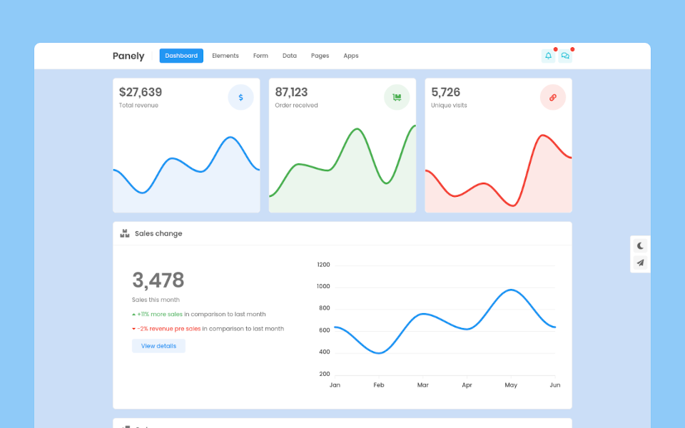
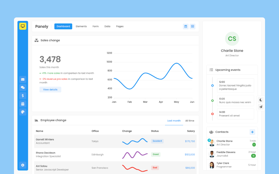
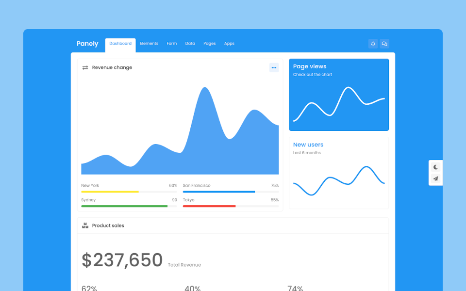
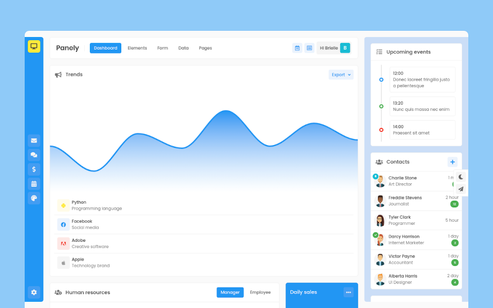
Panely

Garrett Winters
UX DesignerLorem ipsum dolor sit amet, consectetur adipisicing elit. Unde, eius.
Lorem ipsum dolor sit amet, consectetur adipisicing elit. Unde, eius.
2 min agoLorem ipsum dolor sit amet, consectetur adipisicing elit. Unde, eius.
1 min agoLorem ipsum dolor sit amet, consectetur adipisicing elit. Unde, eius.
2 min ago
Brielle Williamson
Software EngineerBase Form
Panely
Base
Textual form controls—like <input>s, <select>s, and <textarea>s—are styled with the .form-control class. Included are styles for general appearance, focus state, sizing, and more.
File
For file inputs, swap the .form-control for .form-control-file.
Range
Set horizontally scrollable range inputs using .form-control-range.
Readonly
Add the readonly boolean attribute on an input to prevent modification of the input’s value. Read-only inputs appear darker (just like disabled inputs), but retain the standard cursor.
Readonly plain text
If you want to have <input readonly> elements in your form styled as plain text, use the .form-control-plaintext class to remove the default form field styling and preserve the correct margin and padding..
Sizing
Set heights using classes like .form-control-lg and .form-control-sm.
Checkbox and Radio
Default
By default, any number of checkboxes and radios that are immediate sibling will be vertically stacked and appropriately spaced with .form-check.
Without labels
Add .position-static to inputs within .form-check that don’t have any label text. Remember to still provide some form of label for assistive technologies.
Inline
Group checkboxes or radios on the same horizontal row by adding .form-check-inline to any .form-check.
Disabled state
Add the disabled boolean attribute on an input to prevent user interactions and make it appear darker.