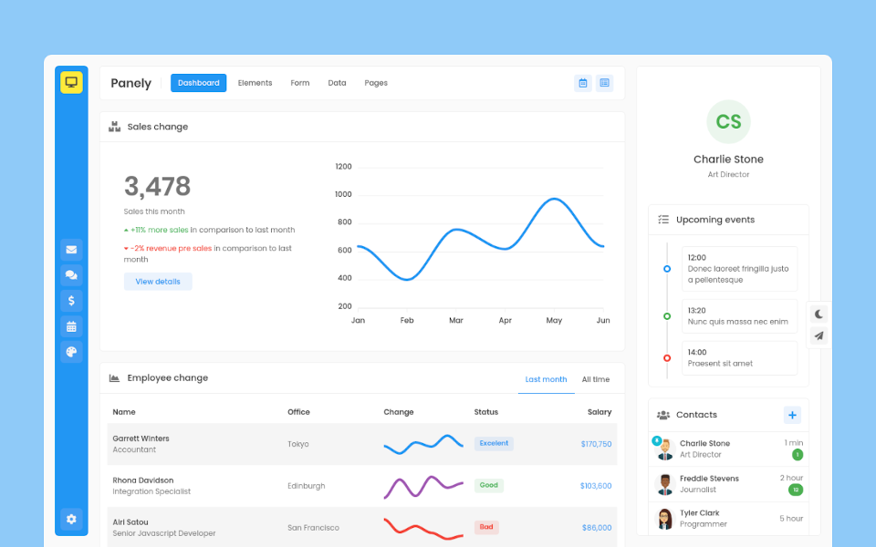
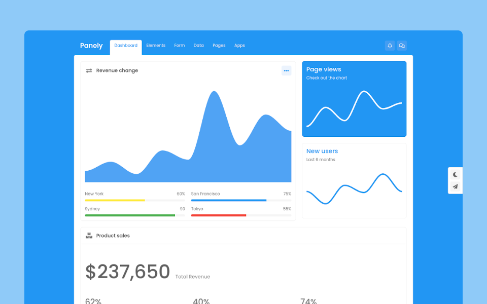
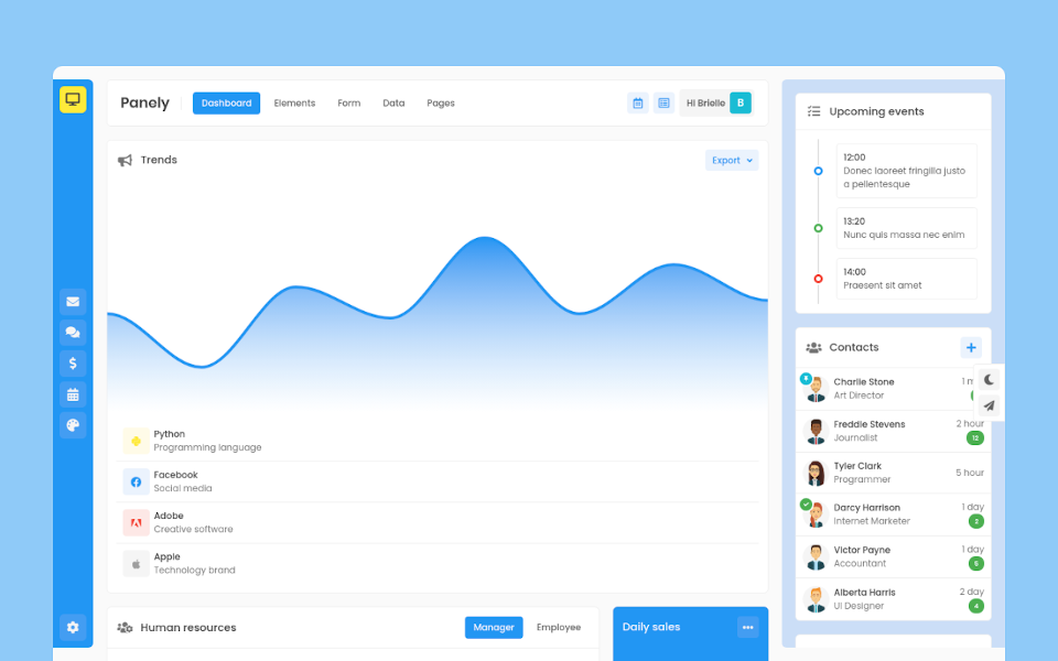
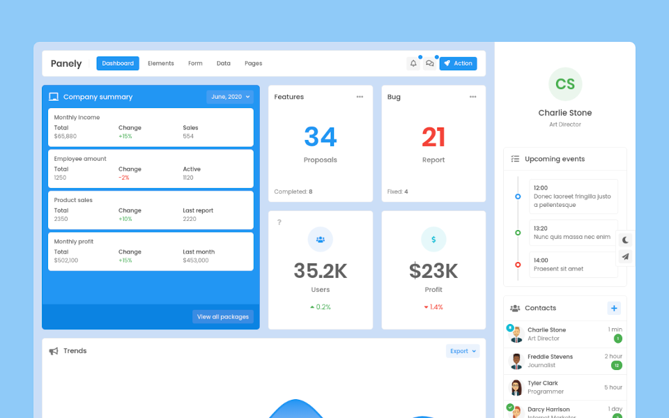
Panely

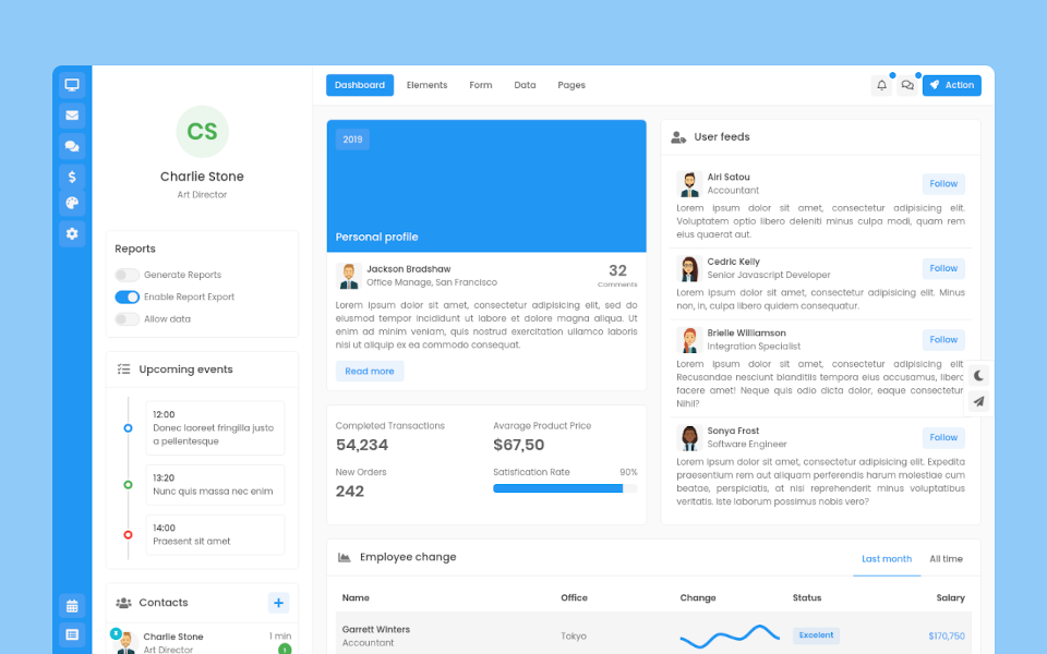
Garrett Winters
UX DesignerLorem ipsum dolor sit amet, consectetur adipisicing elit. Unde, eius.
Lorem ipsum dolor sit amet, consectetur adipisicing elit. Unde, eius.
2 min agoLorem ipsum dolor sit amet, consectetur adipisicing elit. Unde, eius.
1 min agoLorem ipsum dolor sit amet, consectetur adipisicing elit. Unde, eius.
2 min ago
Brielle Williamson
Software EngineerProgress
Panely
Basic
Progress components are built with two HTML elements, some CSS to set the width, and a few attributes.
Striped
Add .progress-bar-striped to any .progress-bar to apply a stripe via CSS gradient over the progress bar’s background color.
Animated
The striped gradient can also be animated. Add .progress-bar-animated to .progress-bar to animate the stripes via CSS3 animations.
Contextual color
Use background utility classes to change the appearance of individual progress bars.
Label
Add labels to your progress bars by placing text within the .progress-bar.
Height
Use predefined modifier classes .progress-{sm|lg} to change progress element height.
Set a height value on the .progress-bar, so if you change that value the outer .progress will automatically resize accordingly.
Multiple
Include multiple progress bars in a progress component if you need.