Panely

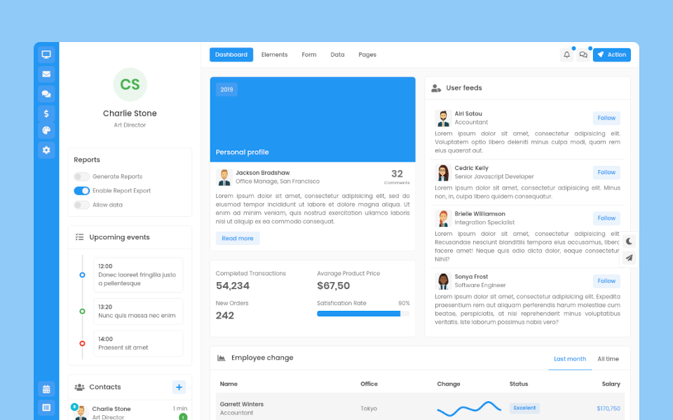
Garrett Winters
UX DesignerLorem ipsum dolor sit amet, consectetur adipisicing elit. Unde, eius.
Lorem ipsum dolor sit amet, consectetur adipisicing elit. Unde, eius.
2 min agoLorem ipsum dolor sit amet, consectetur adipisicing elit. Unde, eius.
1 min agoLorem ipsum dolor sit amet, consectetur adipisicing elit. Unde, eius.
2 min ago
Brielle Williamson
Software EngineerNavigation
Panely
Basic
The base .nav component is built with flexbox and provide a strong foundation for building all types of navigation components. It includes some style overrides (for working with lists), some link padding for larger hit areas, and basic disabled styling.
Default
This is basic example for nav elements
Pill
Take that same HTML, but use .nav-pills instead
Tab
Takes the basic nav from above and adds the .nav-tabs class to generate a tabbed interface.
Line
Take that same HTML, but use .nav-lines instead
Additional elements
You can combine other elements such as badges, icon or caret to separate nav items, we provide .nav-prepend and .nav-append for wrapping those elements.
Add nav-{lg|sm} to make navigations are larger or smaller
Vertical
Add .nav-vertical class to .nav elements for applying vertical appearance, but this feature is not supported for .nav-tabs class.
Pill
Line
Alignment
Change the horizontal alignment of your nav with flexbox utilities. By default, navs are left-aligned, but you can easily change them to center or right aligned.
Fill and justify
Force your .nav's contents to extend the full available width. To proportionately fill all available space with your .nav-items, use .nav-fill. For equal-width elements, use .nav-justified. All horizontal space will be occupied by nav links.