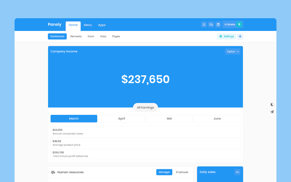
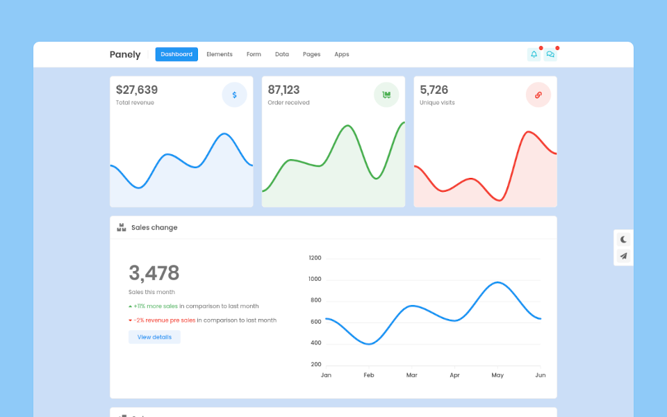
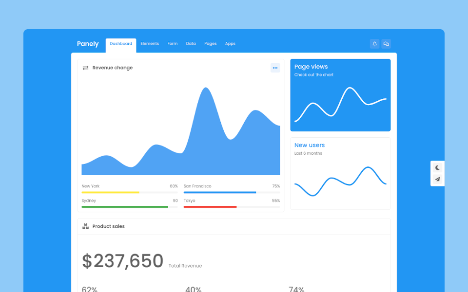
Panely

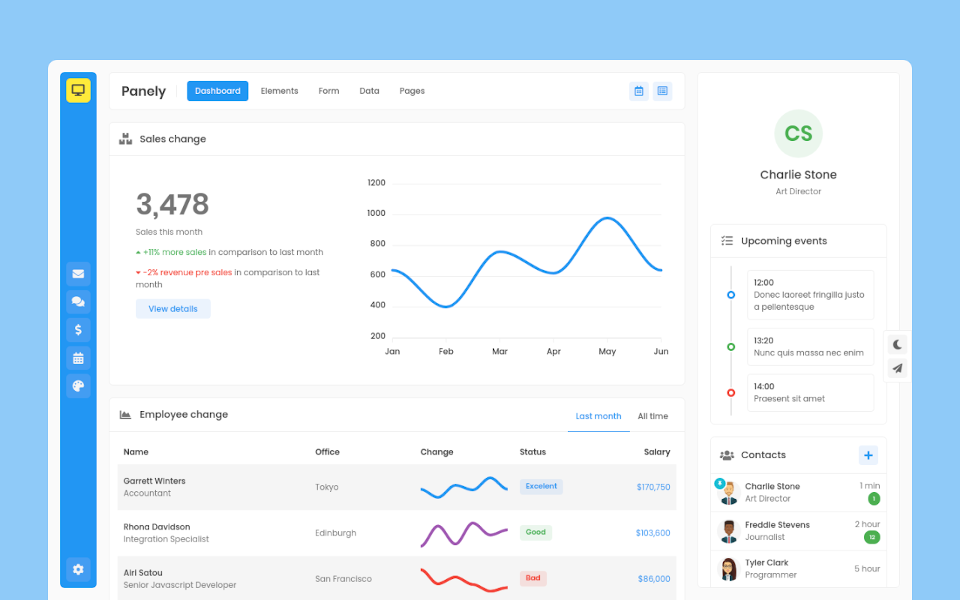
Garrett Winters
UX DesignerLorem ipsum dolor sit amet, consectetur adipisicing elit. Unde, eius.
Lorem ipsum dolor sit amet, consectetur adipisicing elit. Unde, eius.
2 min agoLorem ipsum dolor sit amet, consectetur adipisicing elit. Unde, eius.
1 min agoLorem ipsum dolor sit amet, consectetur adipisicing elit. Unde, eius.
2 min ago
Brielle Williamson
Software EngineerMarker
Panely
Basic
Marker is component that you can use for marking something with shape and color, you can combine it with many components. Marker by default has 3 different shapes, like the example below. Change marker color by applying text color utility (e.q .text-{color})
Dot
Apply .marker-dot class for this shape
Circle
Apply .marker-circle class for this shape
Pill
Apply .marker-pill class for this shape
Sizing
Change marker size to smaller or larger with .marker-{sm|lg} classes
Usage
You can use marker element together with several elements.