Panely

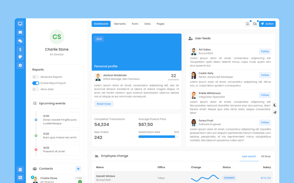
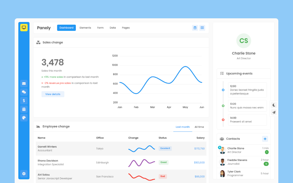
Garrett Winters
UX DesignerLorem ipsum dolor sit amet, consectetur adipisicing elit. Unde, eius.
Lorem ipsum dolor sit amet, consectetur adipisicing elit. Unde, eius.
2 min agoLorem ipsum dolor sit amet, consectetur adipisicing elit. Unde, eius.
1 min agoLorem ipsum dolor sit amet, consectetur adipisicing elit. Unde, eius.
2 min ago
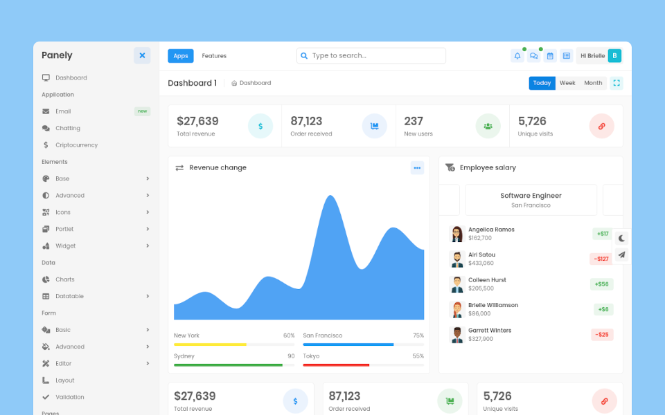
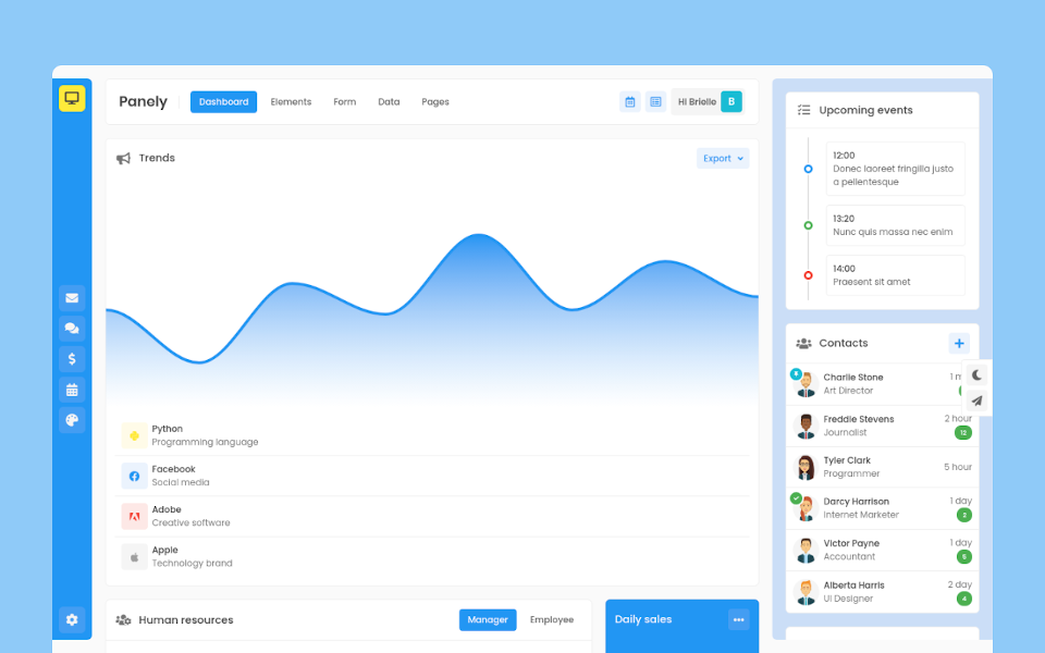
Brielle Williamson
Software Engineer
9+
Color
Panely
Contextual color
We have a series of colors that are used by default and you can use these helper classes for most components
| State | Postfix |
| Primary |
*-primary
|
| Secondary |
*-secondary
|
| Success |
*-success
|
| Info |
*-info
|
| Warning |
*-warning
|
| Danger |
*-danger
|
| Light |
*-light
|
| Dark |
*-dark
|
For each color has its functionality in application as main color of application (primary) or warnings to user (warning)
Button examples
Apply color classes to any component such as button
Contrast level
You can change color or background contrast by applying these helper classes
| Level | Preview | Class |
| Level 1 | Text Color BG Color |
.text-level-1, .bg-level-1
|
| Level 2 | Text Color BG Color |
.text-level-2, .bg-level-2
|
| Level 3 | Text Color BG Color |
.text-level-3, .bg-level-3
|
| Level 4 | Text Color BG Color |
.text-level-4, .bg-level-4
|
Examples
Text
Use text-{color} to applying contextual color to text
Background
Use bg-{color} to applying contextual color to background