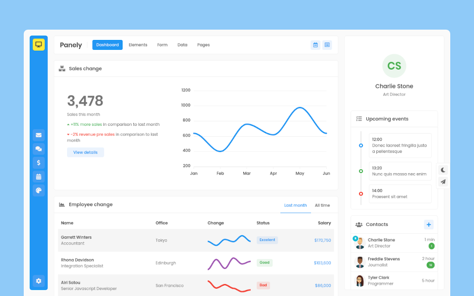
Panely

Garrett Winters
UX DesignerLorem ipsum dolor sit amet, consectetur adipisicing elit. Unde, eius.
Lorem ipsum dolor sit amet, consectetur adipisicing elit. Unde, eius.
2 min agoLorem ipsum dolor sit amet, consectetur adipisicing elit. Unde, eius.
1 min agoLorem ipsum dolor sit amet, consectetur adipisicing elit. Unde, eius.
2 min ago
Brielle Williamson
Software EngineerCard
Panely
Basic
Below is an example of a basic card with mixed content
Card titles are used by adding .card-title to a <h*> tag. In the same way, links are added and placed next to each other by adding .card-link to an <a> tag.
Subtitles are used by adding a .card-subtitle to a <h*> tag. If the .card-title and the .card-subtitle items are placed in a .card-body item, the card title and subtitle are aligned nicely.
Card title
Some quick example text to build on the card title and make up the bulk of the card's content.
Go somewhereCard title
Card subtitle
Some quick example text to build on the card title and make up the bulk of the card's content.
Card link Another linkList group
Mix and match multiple content types to create the card you need, or throw everything in there. Shown below are image styles, blocks, text styles, and a list group—all wrapped in a fixed-width card.
- Cras justo odio
- Dapibus ac facilisis in
- Vestibulum at eros
- Cras justo odio
- Dapibus ac facilisis in
- Vestibulum at eros
Card title
Some quick example text to build on the card title and make up the bulk of the card's content.
- Cras justo odio
- Dapibus ac facilisis in
- Vestibulum at eros
Navigation
Add some navigation to a card’s header (or block) with nav.
Special title treatment
With supporting text below as a natural lead-in to additional content.
Go somewhereSpecial title treatment
With supporting text below as a natural lead-in to additional content.
Go somewhereSpecial title treatment
With supporting text below as a natural lead-in to additional content.
Go somewhereHorizontal
Using a combination of grid and utility classes, cards can be made horizontal in a mobile-friendly and responsive way. In the example below, we remove the grid gutters with .no-gutters and use .col-md-* classes to make the card horizontal at the md breakpoint. Further adjustments may be needed depending on your card content.
Card title
This is a wider card with supporting text below as a natural lead-in to additional content. This content is a little bit longer.
Last updated 3 mins ago
Image
.card-img-top places an image to the top of the card. With .card-text, text can be added to the card. Text within .card-text can also be styled with the standard HTML tags.
Similar to headers and footers, cards can include top and bottom “image caps”—images at the top or bottom of a card.
Card title
This is a wider card with supporting text below as a natural lead-in to additional content. This content is a little bit longer.
Last updated 3 mins ago
Card title
This is a wider card with supporting text below as a natural lead-in to additional content. This content is a little bit longer.
Last updated 3 mins ago
Turn an image into a card background and overlay your card’s text. Depending on the image, you may or may not need additional styles or utilities.

Header and footer
Add an optional header and/or footer within a card. Card header can be contain title, icon, or other elements.
Header
Special title treatment
With supporting text below as a natural lead-in to additional content.
Go somewhereHeader
Special title treatment
With supporting text below as a natural lead-in to additional content.
Go somewhereHeader
Special title treatment
With supporting text below as a natural lead-in to additional content.
Go somewhereAlignment
You can quickly change the text alignment of any card—in its entirety or specific parts—with our text align classes.
Special title treatment
With supporting text below as a natural lead-in to additional content.
Go somewhereSpecial title treatment
With supporting text below as a natural lead-in to additional content.
Go somewhereSpecial title treatment
With supporting text below as a natural lead-in to additional content.
Go somewhereCard groups
Use card groups to render cards as a single, attached element with equal width and height columns.
Card title
This is a wider card with supporting text below as a natural lead-in to additional content. This content is a little bit longer.
Card title
This card has supporting text below as a natural lead-in to additional content.
Card title
This is a wider card with supporting text below as a natural lead-in to additional content. This card has even longer content than the first to show that equal height action.
Card decks
Need a set of equal width and height cards that aren’t attached to one another? Use card decks.
Card title
This is a longer card with supporting text below as a natural lead-in to additional content. This content is a little bit longer.
Last updated 3 mins ago
Card title
This card has supporting text below as a natural lead-in to additional content.
Last updated 3 mins ago
Card title
This is a wider card with supporting text below as a natural lead-in to additional content. This card has even longer content than the first to show that equal height action.
Last updated 3 mins ago
Collumns
Cards can be organized into Masonry-like columns with just CSS by wrapping them in .card-columns. Cards are built with CSS column properties instead of flexbox for easier alignment. Cards are ordered from top to bottom and left to right.
Card title that wraps to a new line
This is a longer card with supporting text below as a natural lead-in to additional content. This content is a little bit longer.
Lorem ipsum dolor sit amet, consectetur adipiscing elit. Integer posuere erat a ante.
Card title
This card has supporting text below as a natural lead-in to additional content.
Last updated 3 mins ago
Lorem ipsum dolor sit amet, consectetur adipiscing elit. Integer posuere erat.
Card title
This card has a regular title and short paragraphy of text below it.
Last updated 3 mins ago
Lorem ipsum dolor sit amet, consectetur adipiscing elit. Integer posuere erat a ante.
Card title
This is another card with title and supporting text below. This card has some additional content to make it slightly taller overall.
Last updated 3 mins ago