Panely

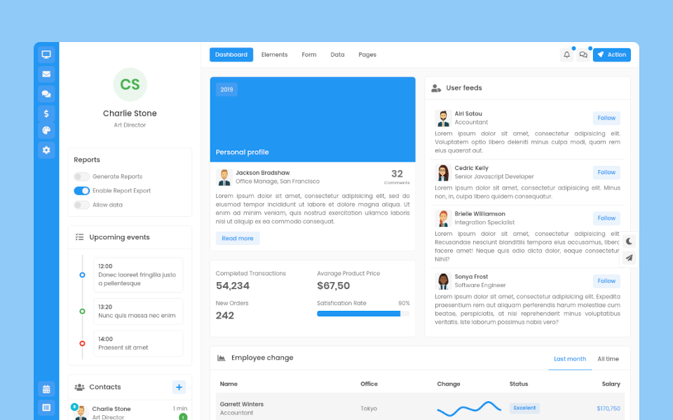
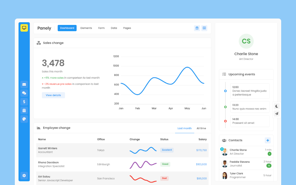
Garrett Winters
UX DesignerLorem ipsum dolor sit amet, consectetur adipisicing elit. Unde, eius.
Lorem ipsum dolor sit amet, consectetur adipisicing elit. Unde, eius.
2 min agoLorem ipsum dolor sit amet, consectetur adipisicing elit. Unde, eius.
1 min agoLorem ipsum dolor sit amet, consectetur adipisicing elit. Unde, eius.
2 min ago
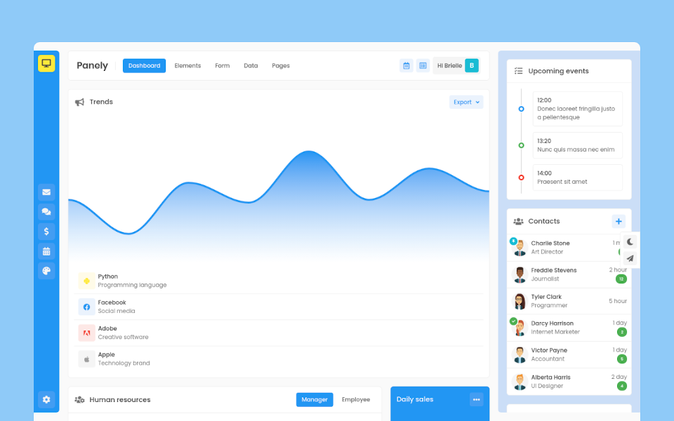
Brielle Williamson
Software EngineerButton Group
Panely
Basic
Wrap a series of buttons with .btn in .btn-group.
Sizing
Instead of applying button sizing classes to every button in a group, just add .btn-group-{lg|sm} to each .btn-group, including each one when nesting multiple groups.
Split button
Create split button dropdowns with virtually the same markup as single button dropdowns, but with the addition of .dropdown-toggle-split for proper spacing around the dropdown caret.
Vertical
Make a set of buttons appear vertically stacked rather than horizontally
Toolbar
Combine sets of button groups into button toolbars for more complex components. Use utility classes as needed to space out groups, buttons, and more.
Nesting
Place a .btn-group within another .btn-group when you want dropdown menus mixed with a series of buttons.
Button plugin
Do more with buttons. Control button states or create groups of butons for more components like toolbars.
Add data-toggle="button" to toggle a button's active state. If you're pre-toggling a button, you must manually add the .active class to the <button>