Panely

Basic

Add any of the below mentioned modifier classes to change the appearance of a badge.

Solid

Use .badge-{color} to apply these variant.

primary secondary succes warning danger dark light

Outline

Use .badge-outline-{color} to apply these variant.

primary secondary succes warning danger dark light

Label

Use .badge-label-{color} to apply these variant.

primary secondary succes warning danger dark light

Text

Use .badge-text-{color} to apply these variant.

primary secondary succes warning danger dark light

Sizing

Change your badges size by adding .badge-{lg|xl} modifier classes.

primary secondary succes warning danger dark

Shaped badges

Make your badge into a circle or square shape by adding .badge-{circle|square} modifier classes.

Circle

A B C D E F

Square

A B C D E F

Links

Using the contextual .badge-{color} classes on an <a> element quickly provide actionable badges with hover and focus states.

Primary Secondary Success Danger Warning Info Light Dark

Pill badges

Use the .badge-pill modifier class to make badge element more rounded.

primary secondary success warning danger dark light

Examples

Header with badge

Heading badge

Badge inside button

May 14, 2020

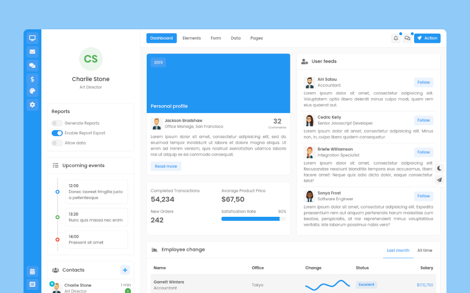
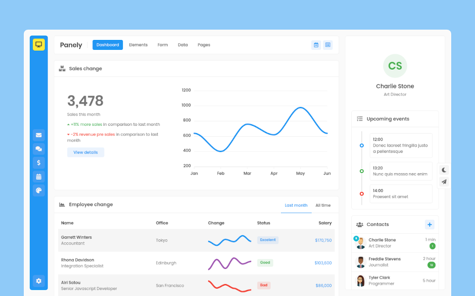
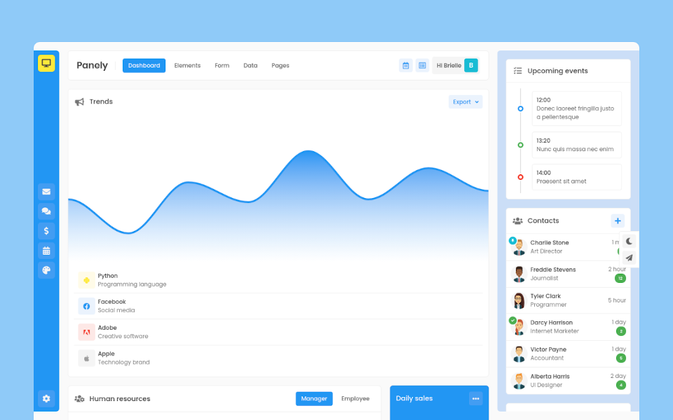
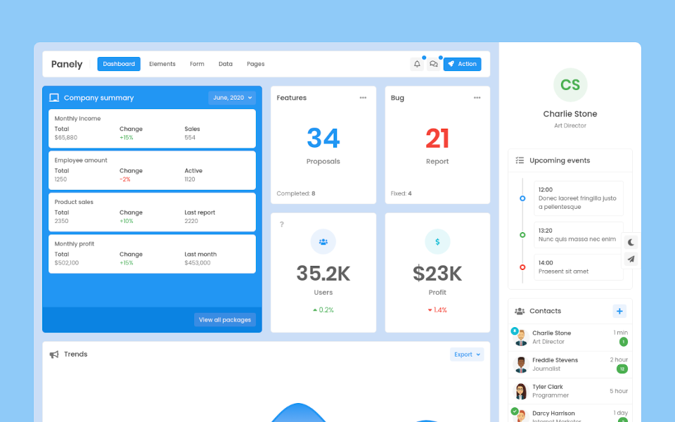
Upcoming events

12:00

Donec laoreet fringilla justo a pellentesque

13:20

Nunc quis massa nec enim

14:00

Praesent sit amet

Settings

Performance

CPU Load
60%
CPU Temparature
42°
RAM Usage
6,532 MB

Customer care

Reports

Projects

Dashboard

Dashboard 1

Dashboard 2

Dashboard 3

Dashboard 4

Dashboard 5

Dashboard 6

Dashboard 7

Dashboard 8

Email

Criptocurrency

Chatting

Navigation